

ADVERTISEMENT

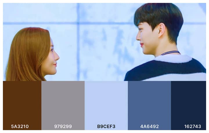
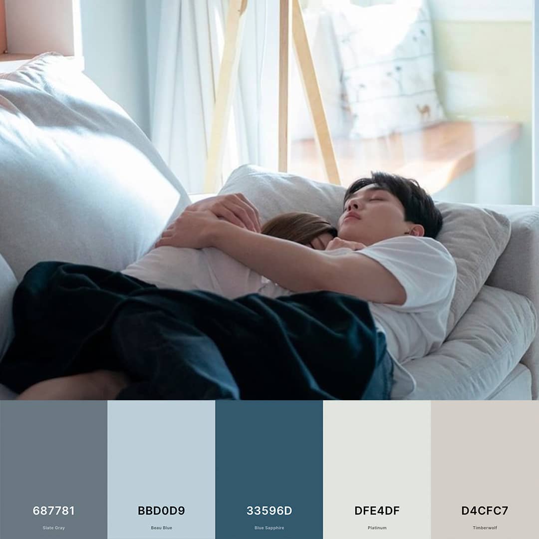
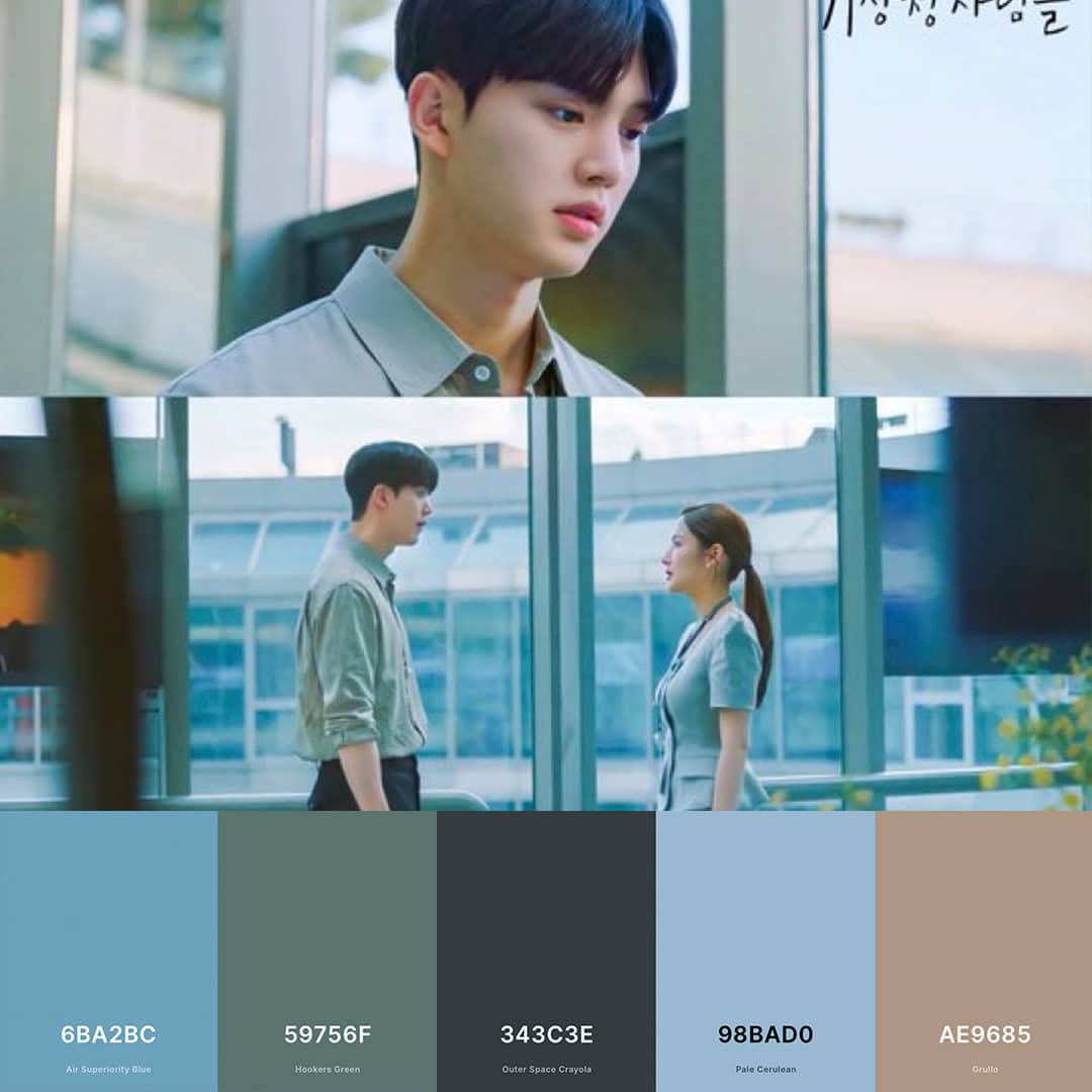
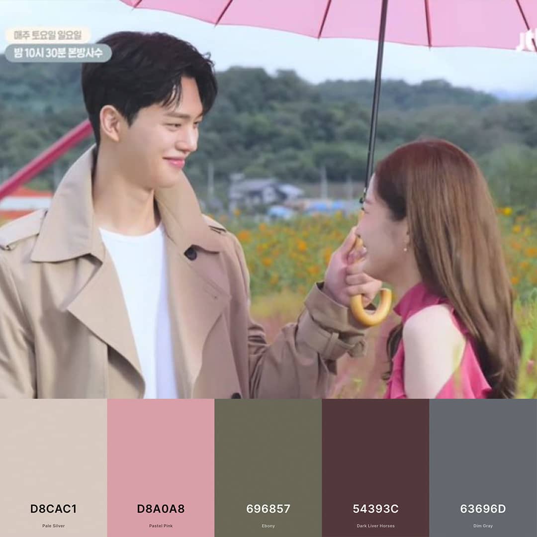
Netflix’s “Forecasting Love And Weather” is a romance set in a meteorological office. It’s got the perfect romantic K-Drama tropes: she’s an uptight professional, with everything in her life having to be in place, while he’s a free spirit. It’s an unpredictable journey, just like the weather, but they somehow manage to fall in love.
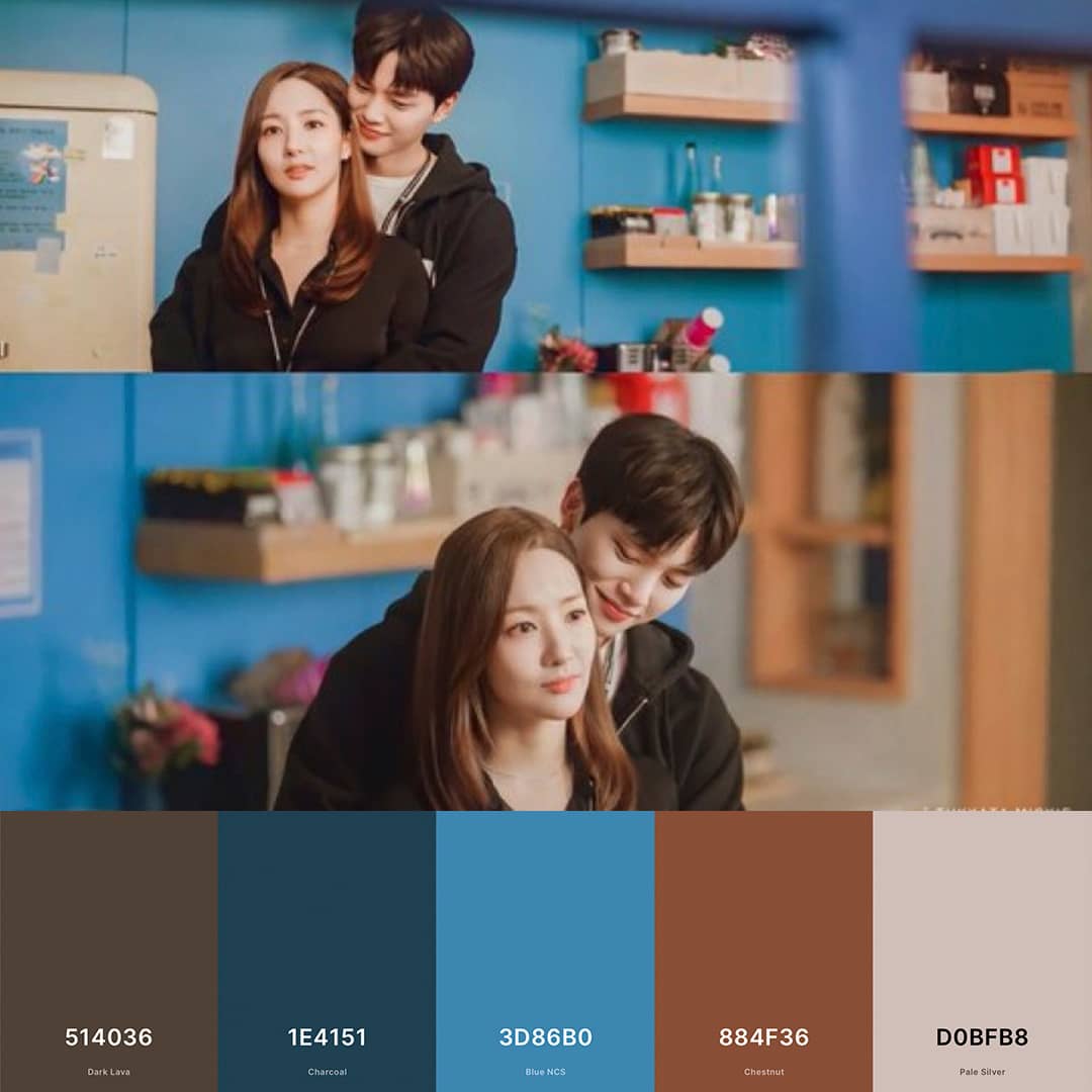
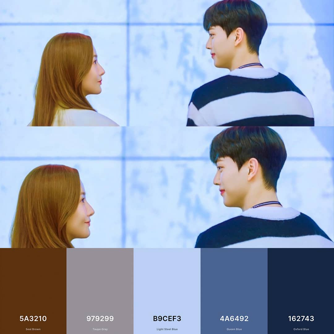
Filmed largely in the Korea Meteorological Administration (KMA), viewers are treated to an insider’s perspective on the rather exciting behind the scenes life of the pros involved in weather and disaster operations from weather-related calamities. Outside of the KMA, other notable locations are the Gamaksan Mountain, named after the dark blue and rocky topography. One of the major weather centers in South Korea, The Gwangdeoksan Weather Radar Center is also featured in the show.
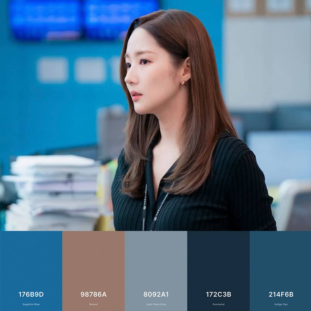
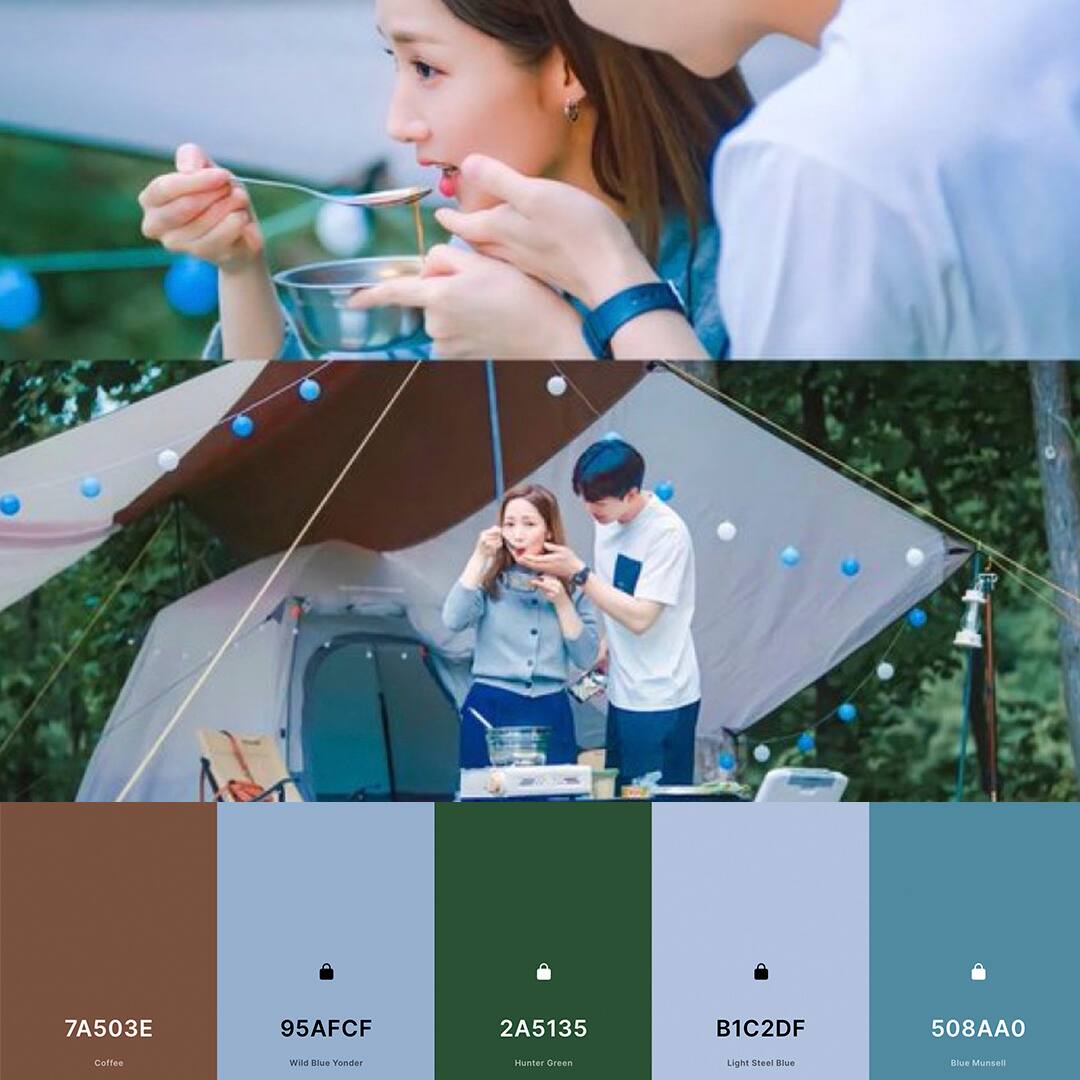
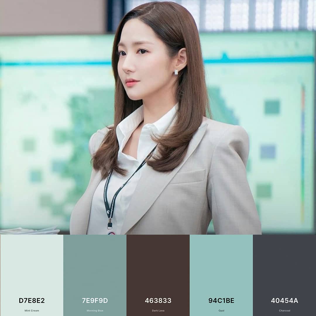
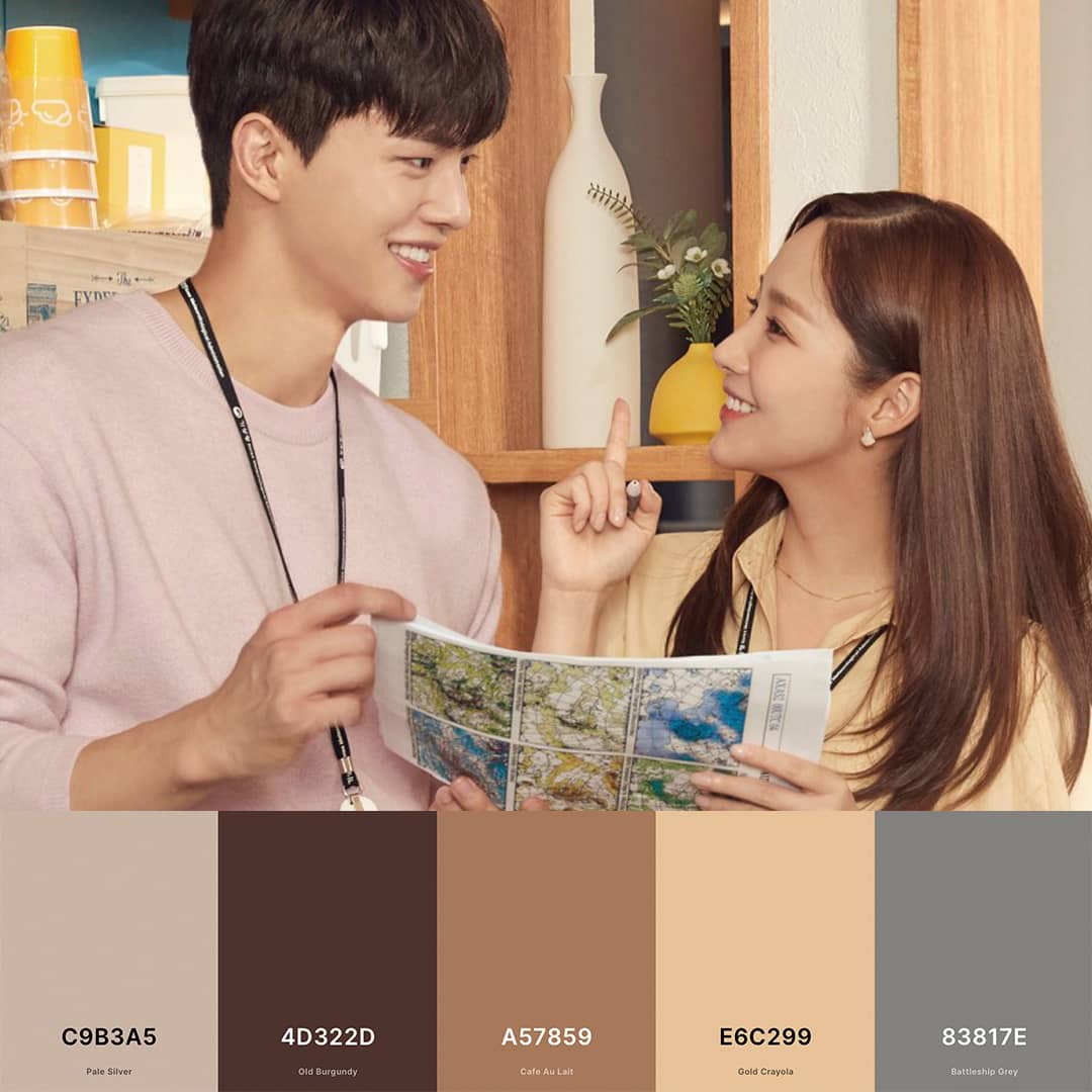
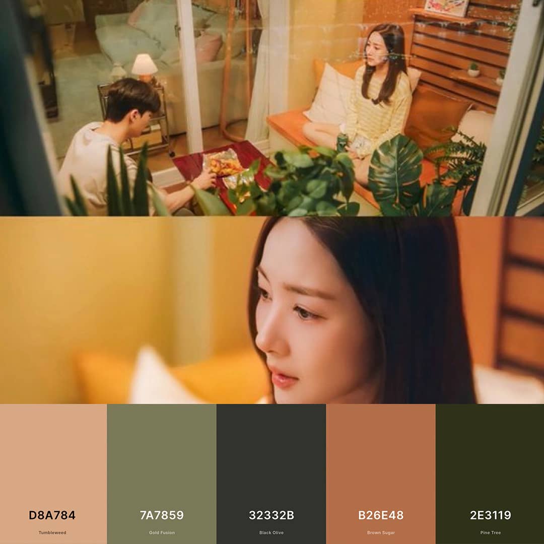
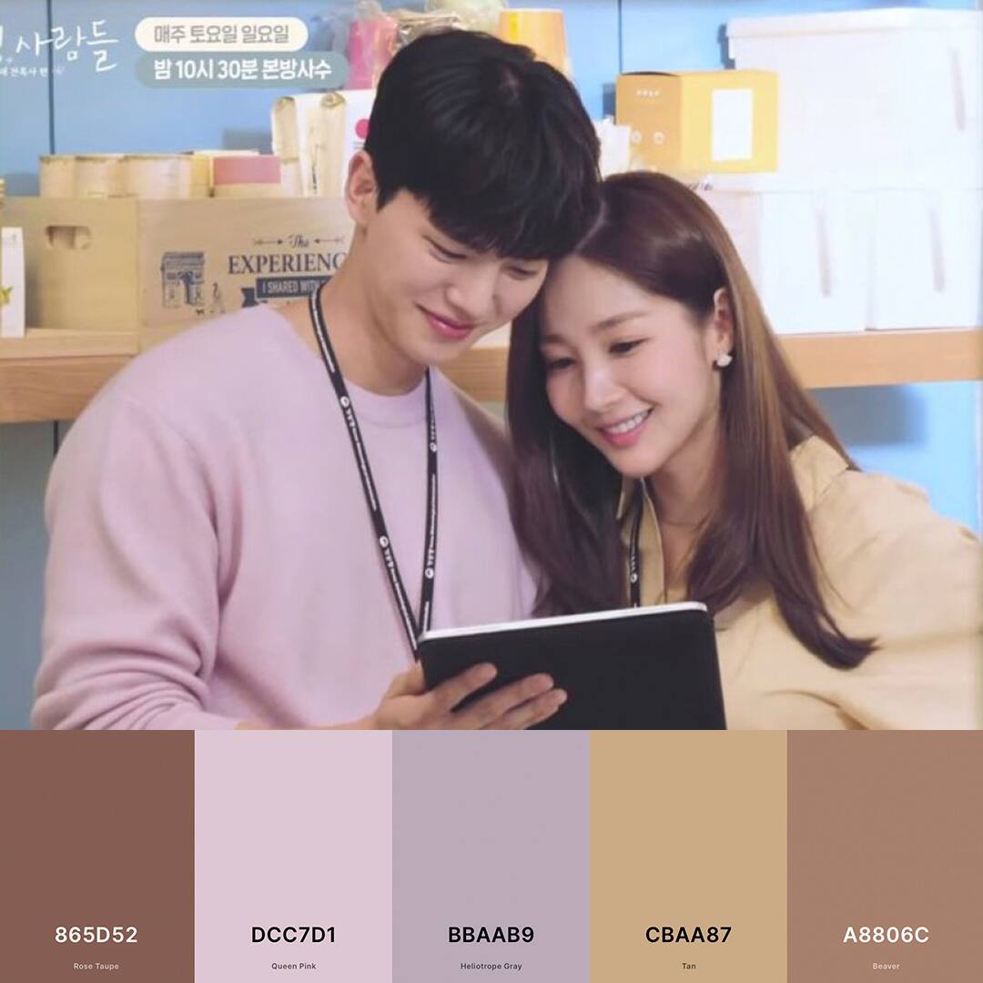
With such locations, the production design team was able to keep to a disciplined color palette that evoked nature in this show. The predominant use of blue hues is seen here, coupled with chalky greens, grounded tones, calm neutrals and comforting earth tones. Harmonious pinks and optimistic yellows are also occasionally seen in the frames, along with saturated deep greens.
These nature-inspired colors lend themselves to a number of applications:
ADVERTISEMENT
Consider painting all surfaces of a room, including skirting, moldings and walls with one or closely-related colors. This allows for the color to become the room’s focal point, making an impactful design statement.
The darker shades of these nature-inspired colors create a feeling of shelter and warmth. When applied to a whole room, they inspire a feeling of intimacy and comfort.
Some call the ceiling “the fifth wall.” Recall a bright sky by painting the ceiling a bright light blue. This magically makes the ceiling feel as though it disappears into the sky.
Beiges with faint undertones of green make soothing walls. Applicable for both modern and traditional homes, this gives an earthy quality, the perfect backdrop for bright pops of color found in furniture and art.
Getting ready to paint your walls this summer?
Metro.Style prepared 10 palettes inspired by Forecasting Love And Weather in the gallery below:
ADVERTISEMENT
ADVERTISEMENT